Layout system
Our gridded layout system evokes the precise intelligence and data behind our operations. It ensures clarity, simplicity and balance in a way that is easily applied to all our communications.
This allows us to maintain consistency, and is both controlled enough to maintain V.’s distinctive visual identity, and flexible enough to meet all use cases.
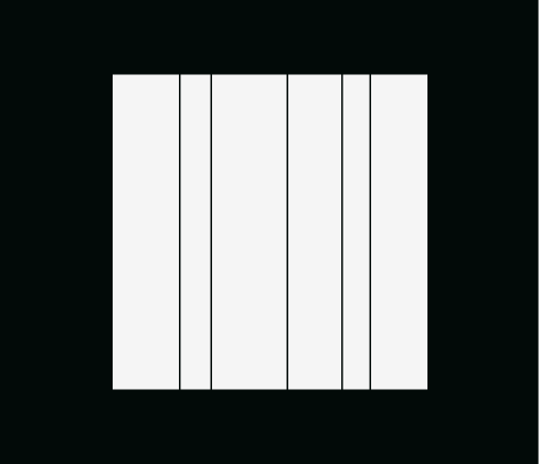
Margins
Our margin sizes are consistent across most common formats: 4% of the shortest edge of the layout. For extremely narrow layouts, we double the margin to 8% of that shortest edge.
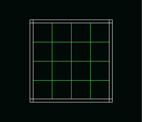
Grid
We use a flexible 8x8 grid across all applications. This ensures a consistent framework across the whole of the brand experience.
Behaviours
Our layout system has three behaviours that can be used to create a variety of different compositions. These are inspired by maritime navigation elements - longitude and latitude lines - which, when combined, give a precise coordinate.
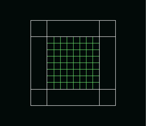
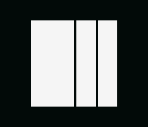
Lines
Longitude, Latitude and Coordinate are formed from lines on our 8x8 grid, with the format-specific margins. To avoid creating too much visual noise, use use up to a maximum of 3 lines each for Latitude and Longitude.
Details and principles

As a general rule, our lines are 1px on digital applications and 1pt on print. In extreme instances with very small or large format applications the value can be changed to visually balance with the composition.
Our gridded layout system can be run in any of the neutral colours in our palette (Mariana Black, Breaker White, Oyster Grey and Anchor Grey).
The gaps in our coordinate lines are equal to our margin value.
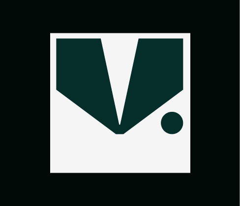
Logo sizing
For communciations our logo can flex in size to meet the needs of different applications. The minimum size our logo can be used is 1 column wide, and the maximum is 6 columns wide.
In instances where the logo is used as a sign-off or introduction (for instance across the slides of a Powerpoint presentation) we can use the logo smaller. Please make sure
to follow the minimum sizings outlined in the Logo section.
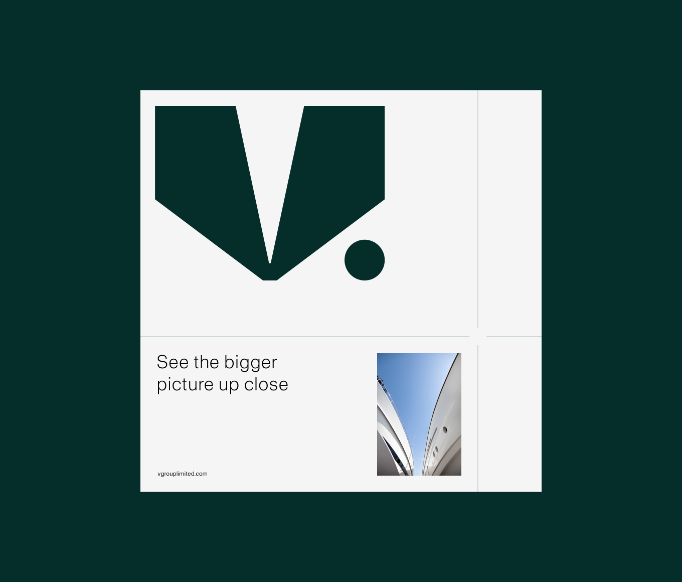
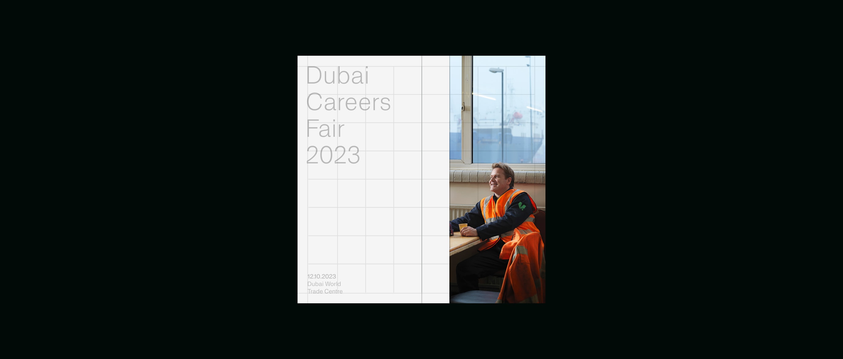
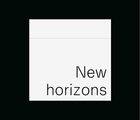
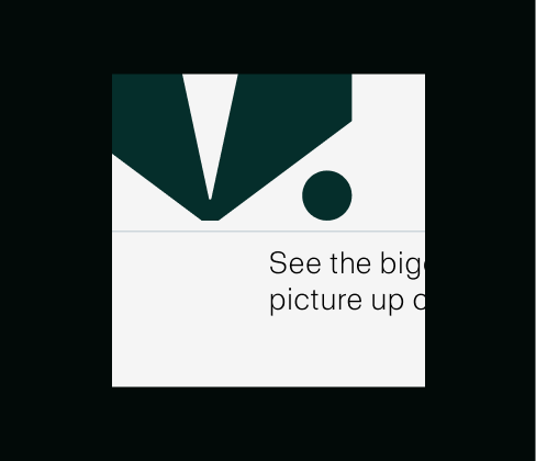
Typography
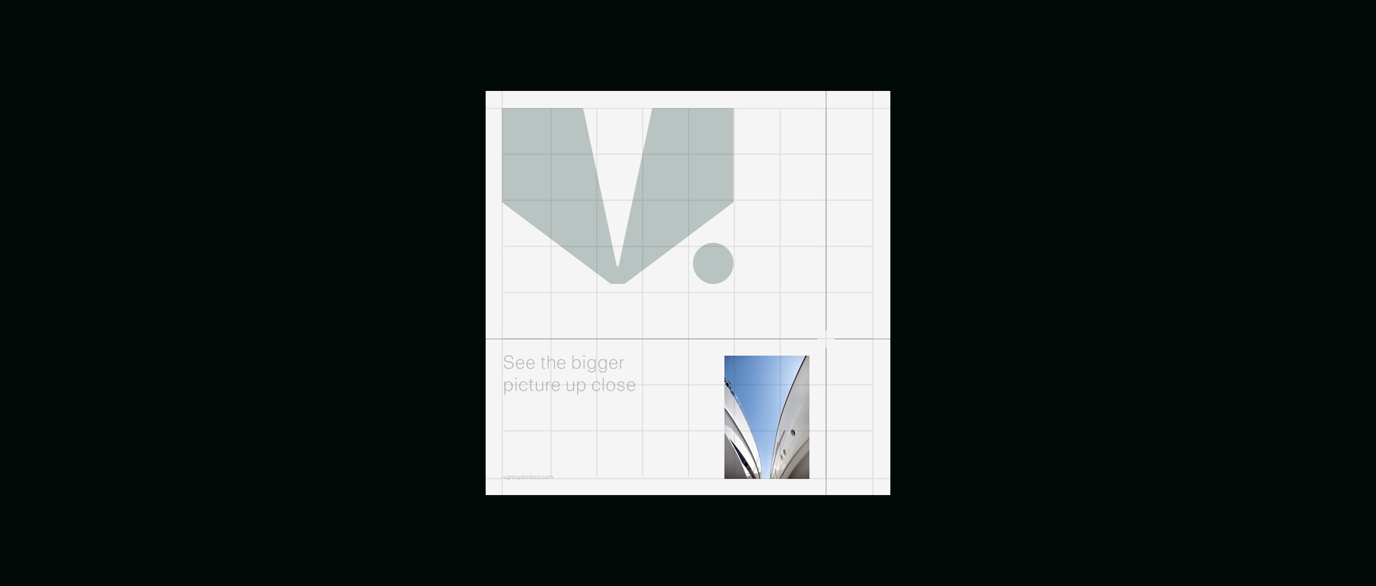
Our text is always left-aligned, and sits within the layout system, as shown below. Placement is flexible, to meet the communiation needs, but messaging should always be clear and easy to read.
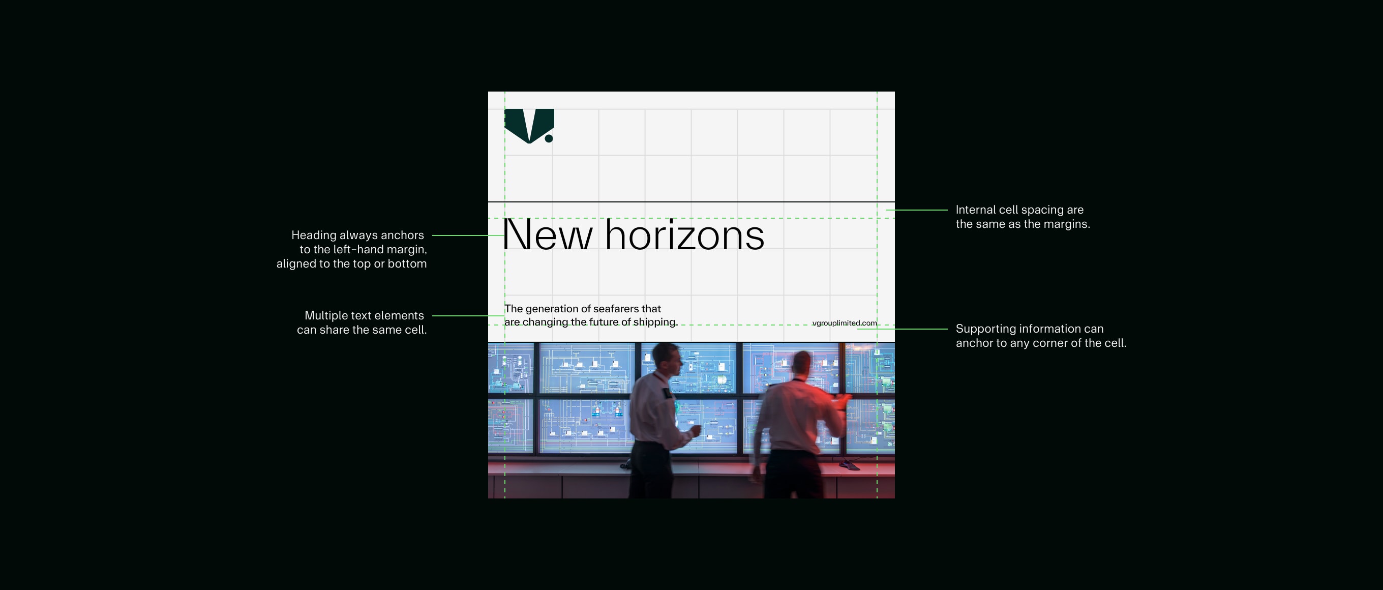
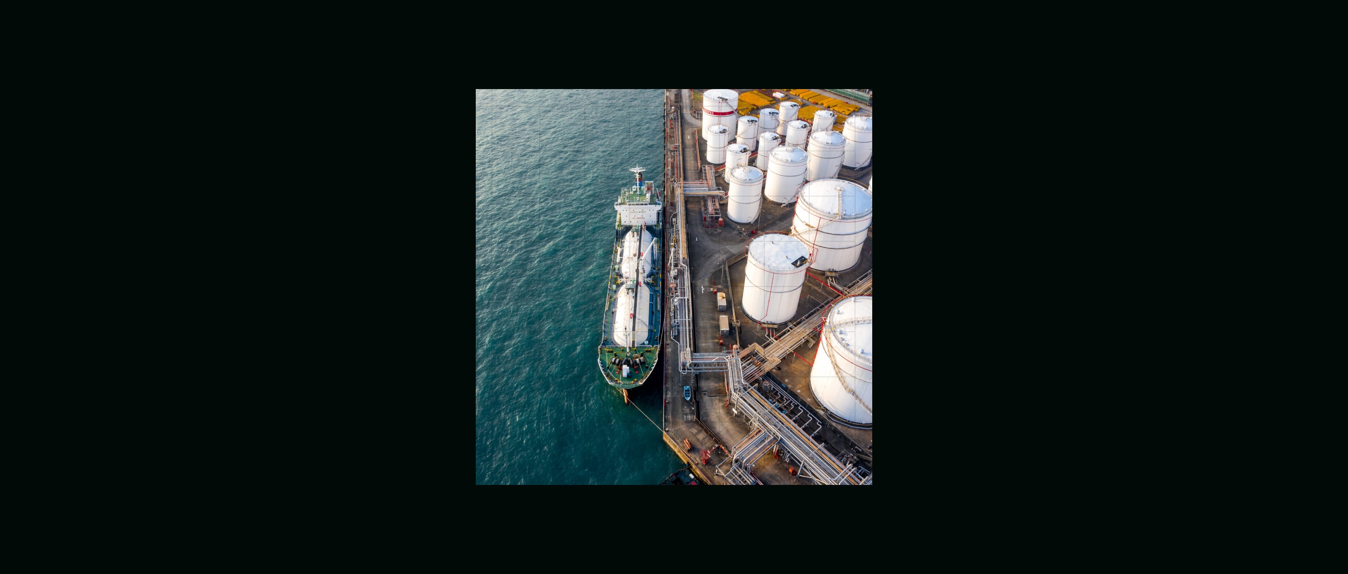
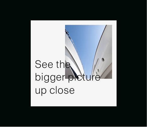
Imagery
Our layout system allows us to be flexible with imagery. There are three ways for imagery to be used: full bleed, full cell and inset. Full bleed imagery takes up the whole canvas or format, full cell imagery fills a whole cell section made from our layout behaviours, and inset imagery sits within the system itself.
Things to avoid
Do not use a different grid.
Do not alter the margin or grid rules.
Do not add more than the maximum lines suggested.
Do not use too heavy a line weight.
Do not go above the specified maximum logo size.
Do not right align type.
Do not overlap elements.
Do not crop off graphic or typographic elements.