Iconography
Our icons make navigating the brand easy and seamless. Each one has been crafted to be clear and concise, while incorporating design details from our logo and typography to effortlessly align with the rest of the brand elements.
Overview
We have two icon types that share common visual styles but help convey different levels of information.
Functional
iconography
Inspiration
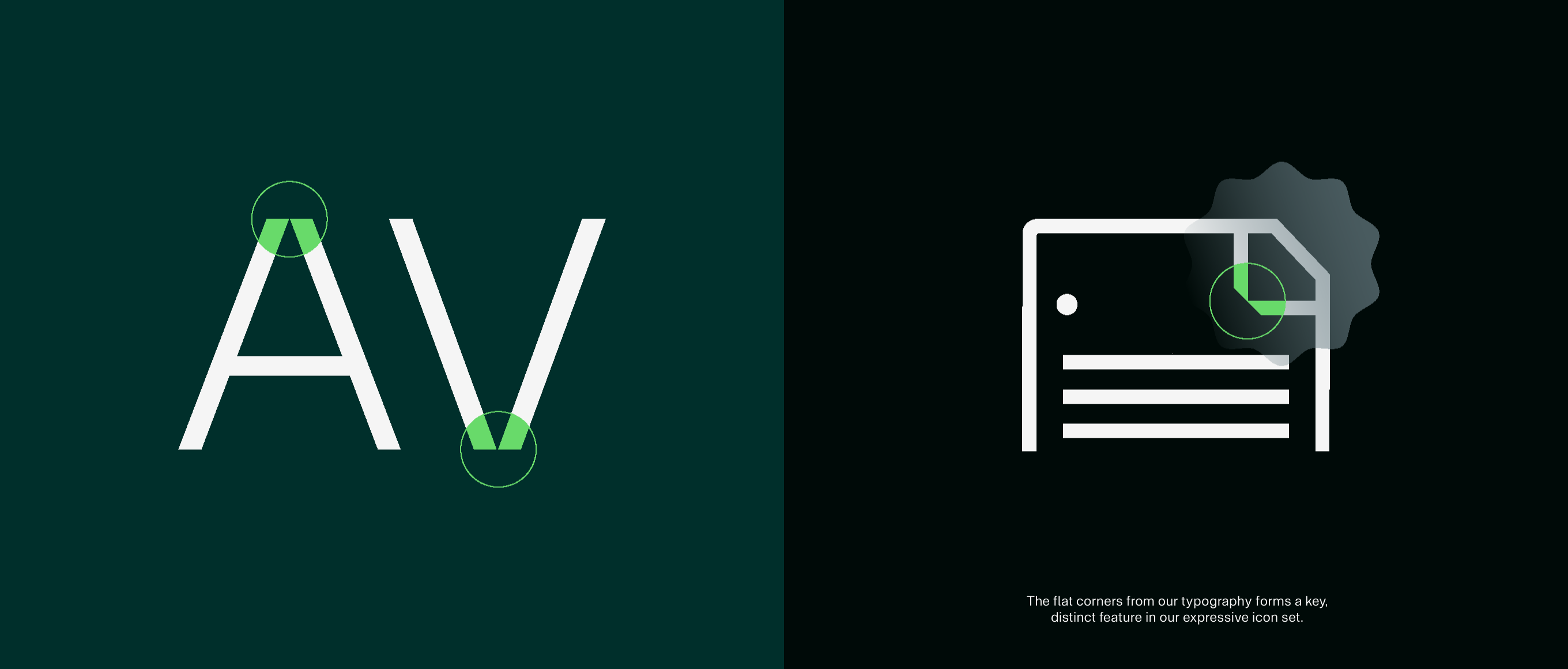
Our functional icons have taken inspiration from details within our wider V. brand toolkit.
Construction
Functional icons are created on a 60x60px grid, with clear space padding on each side to ensure standout.
Designed for use at both small and large sizes, we use a 4px line weight to maintain legibility, and the stroke should be outlined before use for effective scaling.
In use

Things to avoid
Do not change the keyline weight.
Do not fill in our functional icons.
Do not create icons without our flat corner element.
Do not add multiple flat corners.
Only use rounded corners when strictly neccessary.
Do not stretch, distort or add any effects to our functional icons.
Do not use any unspecified colours from our palette.
Do not use any unspecified or illegible colour combinations.
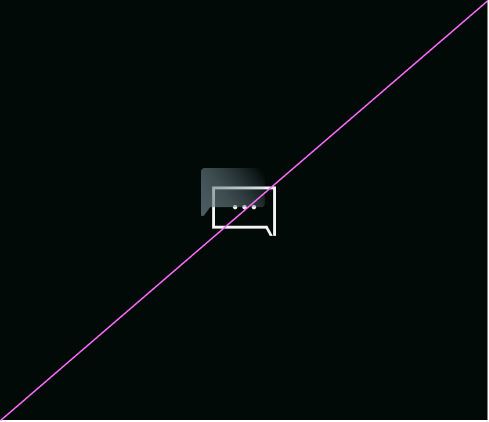
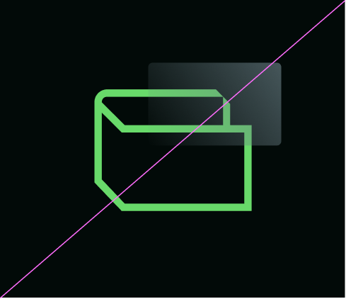
Expressive
iconography
Inspiration
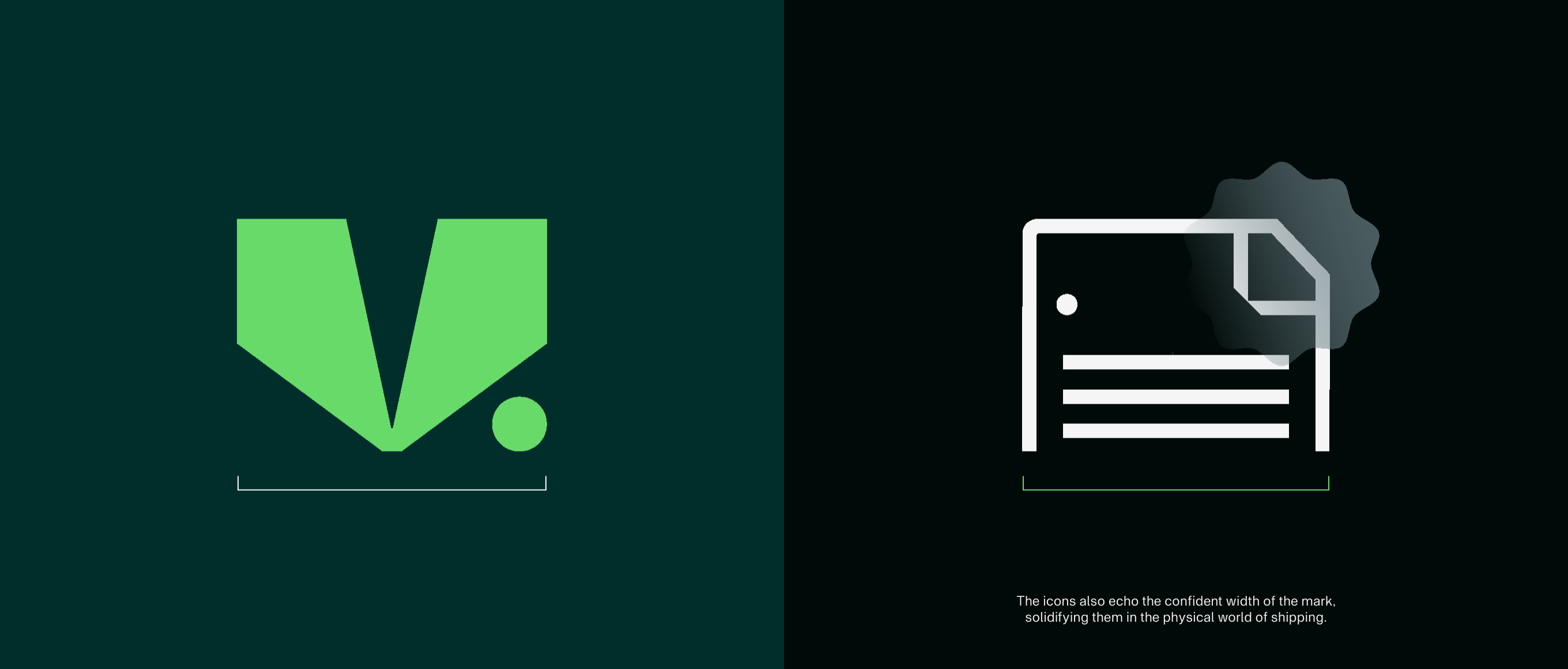
Our expressive icons have taken inspiration from details within our wider V. brand toolkit.
Construction
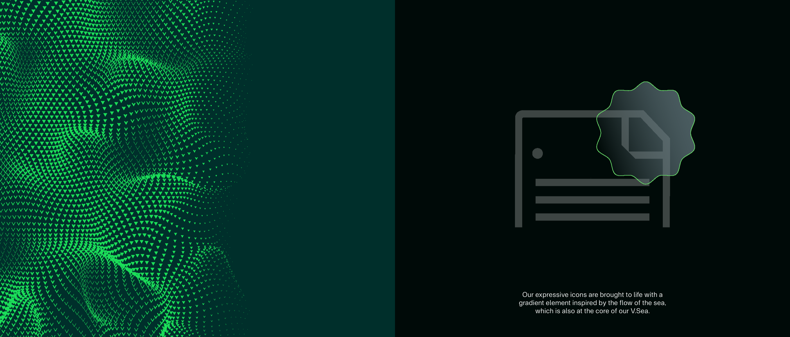
Expressive icons are created on the same 60x60px grid as the functional icons. They keep the same clear space around them as padding, but use a 2px line weight, as they are designed for use at larger sizes. Inspired by details in the wider brand system, they are constructed in keyline style with a single, dynamic gradient element.
In use

Things to avoid
Do not change the keyline weight.
Do not fill in our expressive icons.
Do not create icons without our cuts.
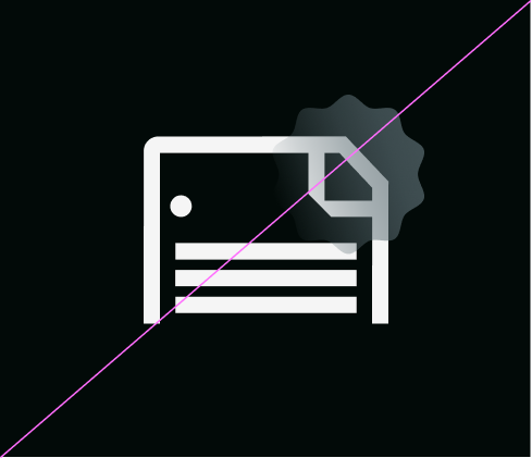
Do not create expressive icons without adding a gradient element.
Do not stretch, distort or add dimension to our expressive icons.
Do not use our expressive icons at small sizes.
Do not use any unspecified colours from our palette.
Do not change the colours in the gradient element.