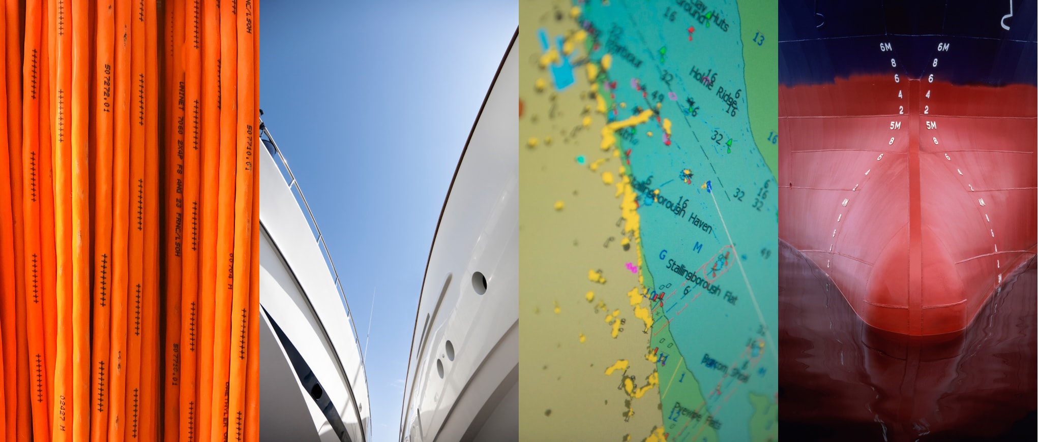
Art direction
Our art direction reflects a broad range of subjects – technology, people and places – to authentically showcase what we do, and how we do it. It allows us to show the sheer scale of V.’s influence – from macro to micro – in a style that is coherent, consistent and distinctly V.
Overview
Our art direction uses three distinct types of imagery: Vision, Partnership and Influence. Each has a unique set of princples and details to keep in mind for execution.
Overview
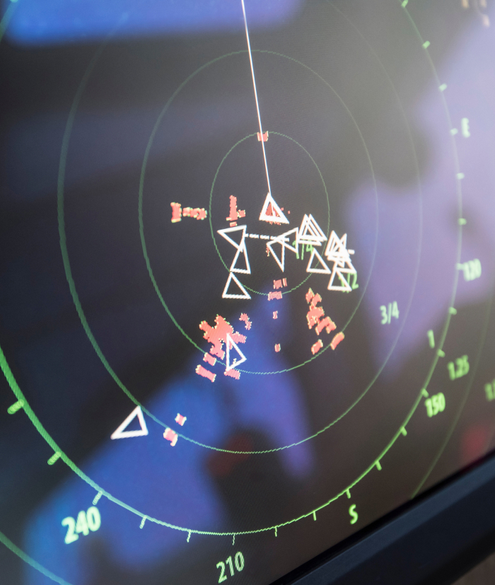
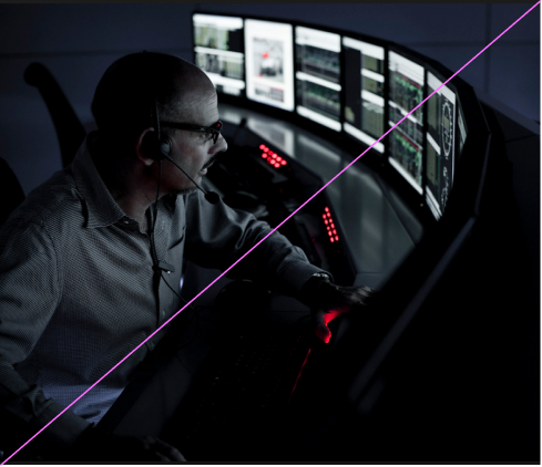
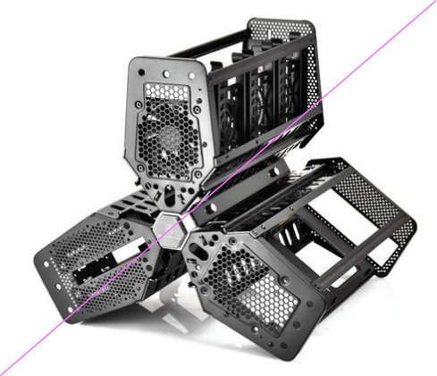
Our Vision imagery showcases the small details behind
the technology and process that provide massive impact
to our partners.
Close crops give a stylised, semi-abstract feel to images
of complex equipment, backing up our intelligent technical capabilities and rigour.
Details and principles


We use close crops and details to focus on the minutae. There should be a clear emphasis on a single point or feature, with clear or neutral space around.
Our Vision imagery has license to be abstract or figurative. We focus in on the tiny details, cutting out the extraneous features and highlighting the micro. Ensure the subject matter being photographed is relevant to V. and our industry.
We make sure to use shots that have a selective range of colours, so as to avoid visual noise. Bright and vibrant colours can be used, but ensure there are not too many contrasting colours in one image.
Overall the image should speak of the technology, the data and the detailed knowledge behind V.’s offering, even at the smallest scale.
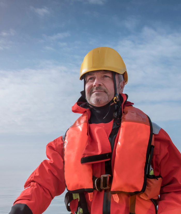
Overview
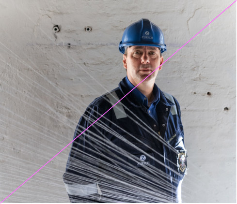
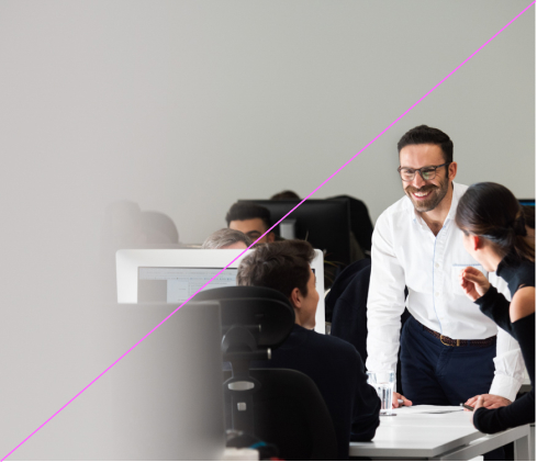
Our Partnership imagery heroes the people at the heart of V., focusing on the individuals that make incredible things happen, working together across the world. The characterful, dynamic style of portrait highlights the human, warm aspects of V. and the wealth of diversity.
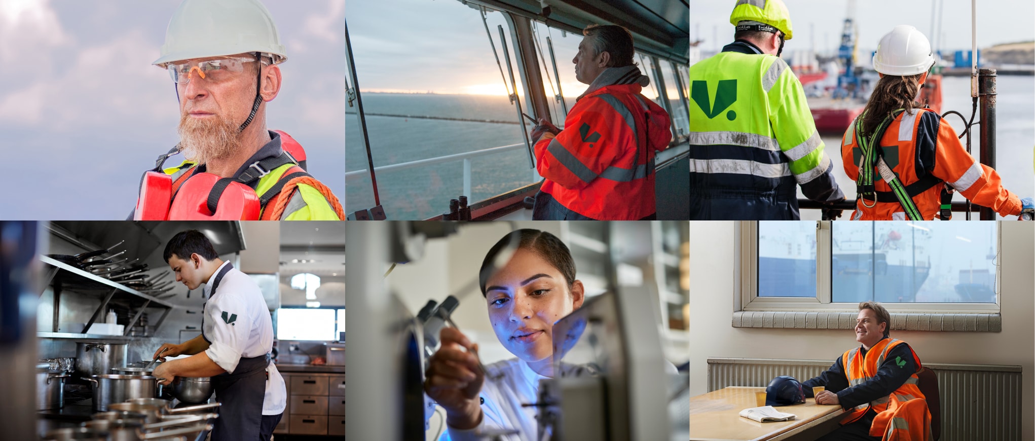
Details and principles
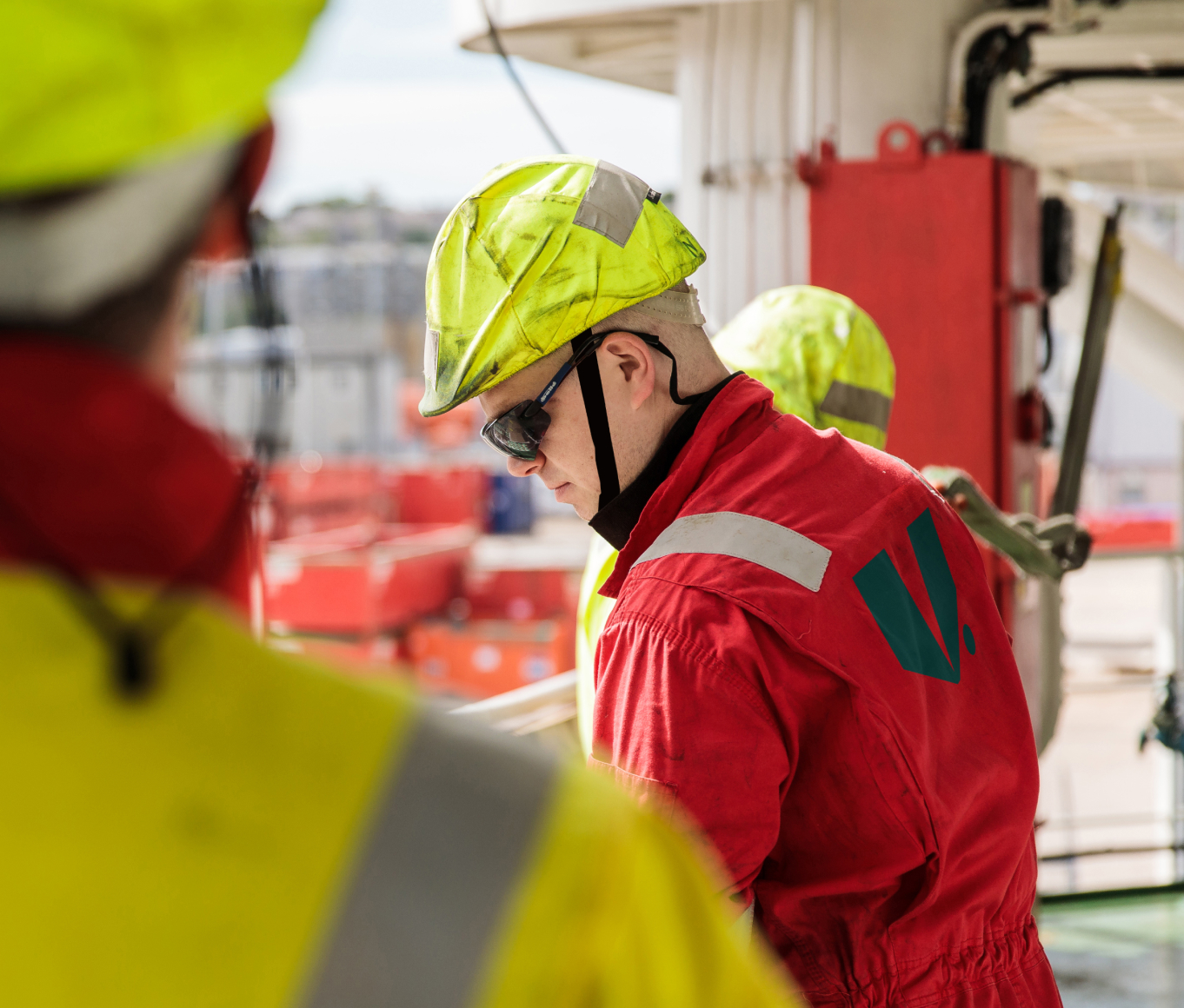

We want to feel as connected to the subject as possible. Our imagery is up close, personal and focused on the individual.
Talent should be shown in an authentic, heroic way. They should look comfortable and confident, reflecting their influence and importance to V.
We make sure to use honest and authentic colours, with nothing too poppy or brash. We make sure images feel positive, rich and warm with nothing that feels forced or unnatural.
Overall, our Partnership images should be an authentic spotlight on the human side of V, showcasing the ever-present heartbeat of the business.
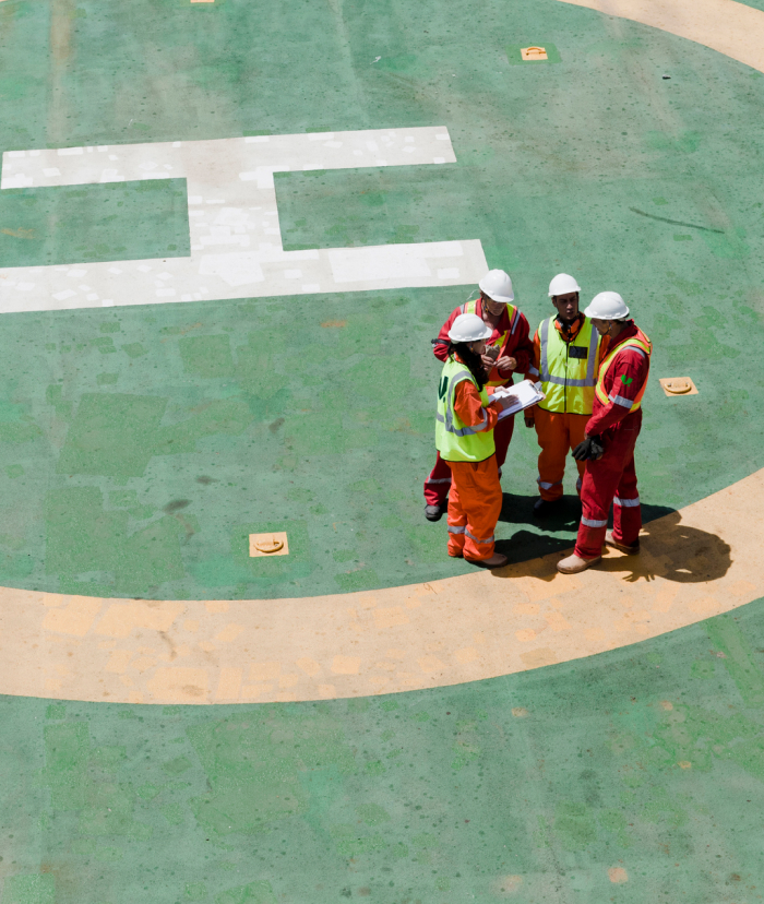
Overview
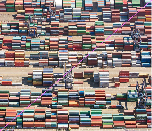
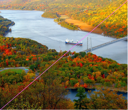
Our Influence imagery zooms out to show the bigger picture, bringing to life the massive scale of impact of V.’s initiatives, as well as the strength of our ambitions for the future.
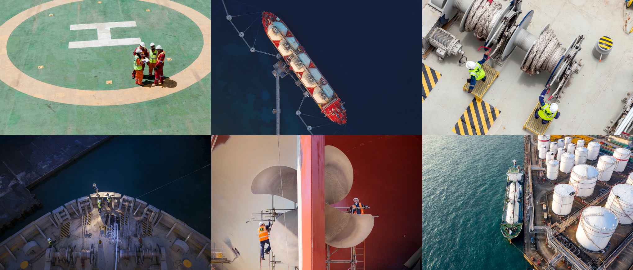
Details and principles


We use wider, more set-back shots to show the scale of V.’s influence. There should be an emphasis on a single subject with clear, neutral space around.
Our Influence imagery shows the human influence against a larger narrative. It uses scale, contrasting the small and big, and juxtaposing their size for impact.
We make sure to use shots that have a selective range of colours, so as to avoid visual noise. Bright and vibrant colours can be used, but visual balance is key.
Overall the image should feel aspirational, grand and far-reaching. It should show the impact of V. at scale, as well as speaking to the global impact possible.
Things to avoid
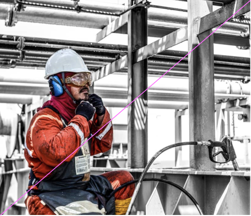
Do not use black and white photography.
Do not use photography that is overly dark or lacks vibrancy.
Do not use imagery that feels overly styled, posed or inauthentic.
Do not use imagery that is overly edited or exposed.
Do not use imagery that is overly busy or complicated.
Do not use Vision imagery that doesn’t highlight a specific detail.
Do not use Partnership imagery that doesn’t hero the subject.
Do not use Influence imagery that doesn’t contain a contrast in scale.