Colour
Our iconic colour palette is inspired by our home – the ocean. Our combination of greens is a truly unique palette that’s built to function effectively across all digital and physical applications. Alongside our extended palette, these colours allow us to communicate more clearly and help us stand out in a competitive field.
Overview
Our core palette consists of our hero colour, V. Green, and our supporting complement of highlights and neutrals, Vision Green, Breaker White and Mariana Black. Using these colours reinforces brand recognition and differentiates us from our competitors.
C 81 M 30 Y 63 K 75
Hex: 052E2B
Pantone: 567 C
NCS : XXX
C 64 M 0 Y 80 K 0
Hex: 68DA6A
Pantone: 7479 C
NCS : XXX
C 5 M 5 Y 4 K 0
Hex: F5F5F5
C 35 M 00 Y 0 K 100
Hex: 020A08
Distribution
V. Green is always our dominant colour. As a general rule, it should make up about 75% of our visual language. Mariana Black and Breaker White should each be used around 10%, while V. Green is a highlight, used sparingly for maximum impact.
Overview
While we stick to our core palette most of the time, when we need extra flexibility, for example in UI elements or graphs, we can draw from the extended palette.
This gives us the flexibility to communciate more complex information.
Hero colour combination
Our hero colour combination of V. Green and Vision Green forms an instantly recognisable pairing, evoking the future-facing and dynamic spirit of V. We use this for our most important messaging: anything that needs particular emphasis or impact.
In use
Supporting colour combinations
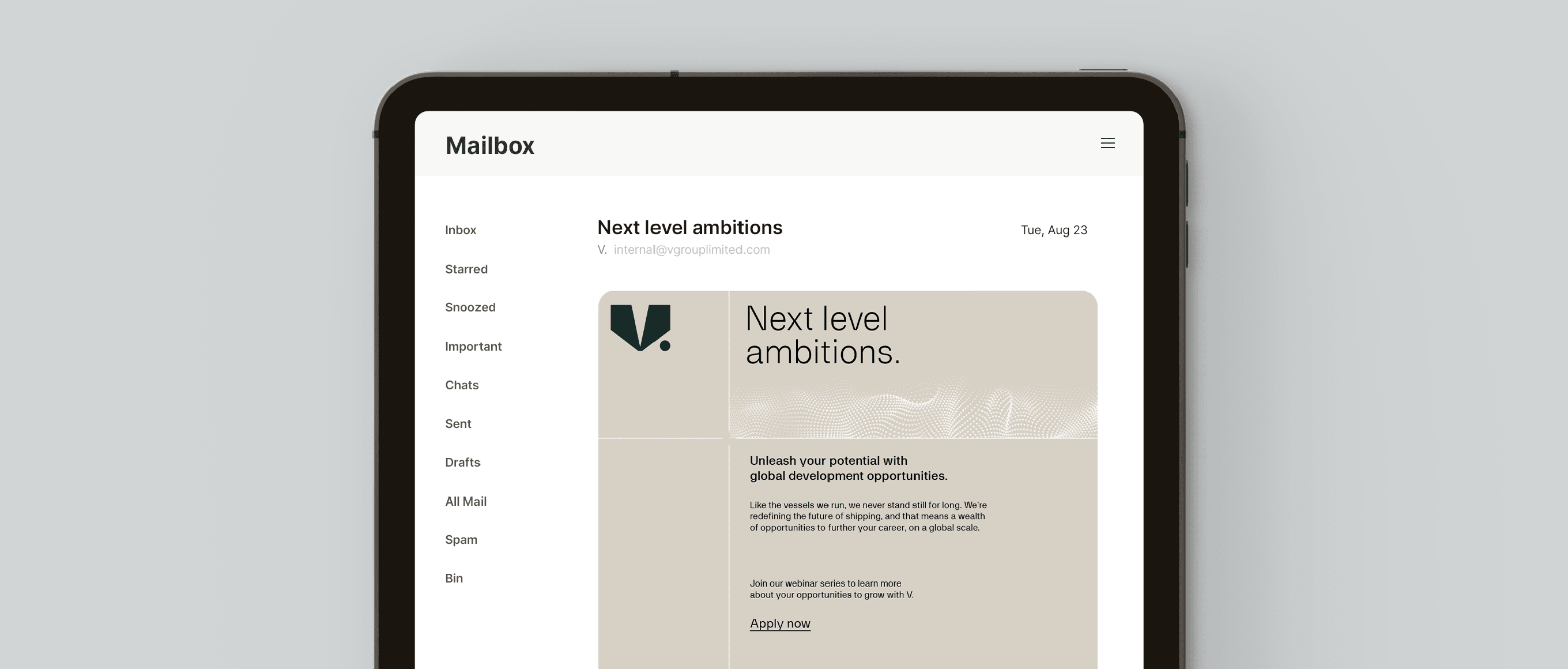
Our supporting colour combinations are more neutral, pairing Breaker White with either V. Green or Mariana Black. We use this when we need something a little more understated to introduce varation, heirarchy and pace to communications.
In use
Extended colour combinations
When audiences have come to associate the brand with our core colours over time, we can begin to introduce more of the neutrals from the extended palette in our combinations to give us further variety and flexibility.
We must always be mindful that audiences need to feel familiar enough with our hero combination and associate it strongly with the V. brand, before branching out to use our extended combinations.
In use
Expression
Use these guiding principles to implement our brand colour palette across applications. Our core palette forms the base, with our hero pairing adding highlight, and flexing to our extended when necessary.
Things to avoid

Don’t use colour combinations that aren’t indicated in the guidelines.

Don’t use colours outside our brand palette.

Do not use Vision Green as a background element.

Do not use our extended palette for background or hero elements.

Do not run text in any of the additional non-specified colours.

Do not apply multiple colours to typography and headlines.

Do not run text over imagery in colours that limit legibilty.

Do not use unspecified tints.


