Logo
Our logo is the beacon of our brand. Inspired by the bow of a ship, it is confident, clear and distinctive. It’s the most easily-identifiable expression of who we are and what we stand for. And, when used consistently, it builds recognition of our brand so when people see the V. they know what it means. Quality, reliability and commitment.
Core logo
Our logo is our most important brand asset and should be used on all communications. It is crafted for standout, confidence and clarity, embodying the values of V.
Clear space
We always keep clear space around our logo to allow it to stand out. We use the dot as a measure to define the clear space so that it feels consistent across any layout variation.
Minimum size
Although our core logo maintains its legibility and distinctiveness at small sizes, it is important to not go smaller than the sizes indicated below.
Placement
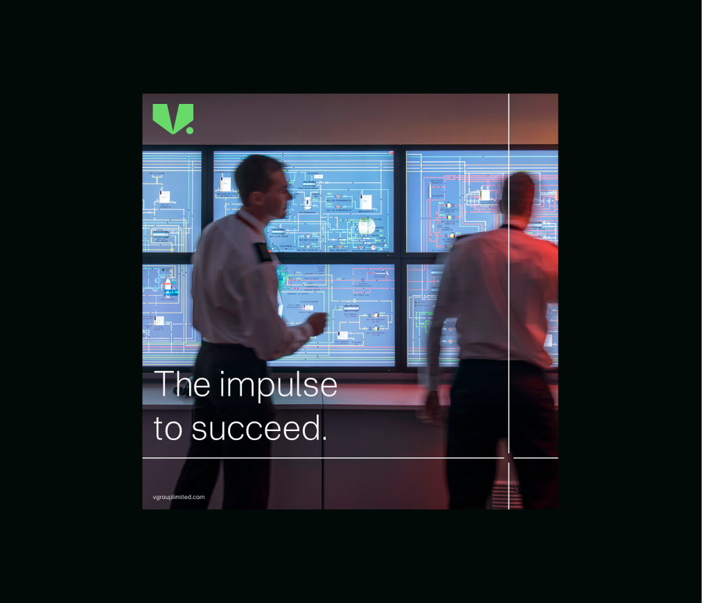
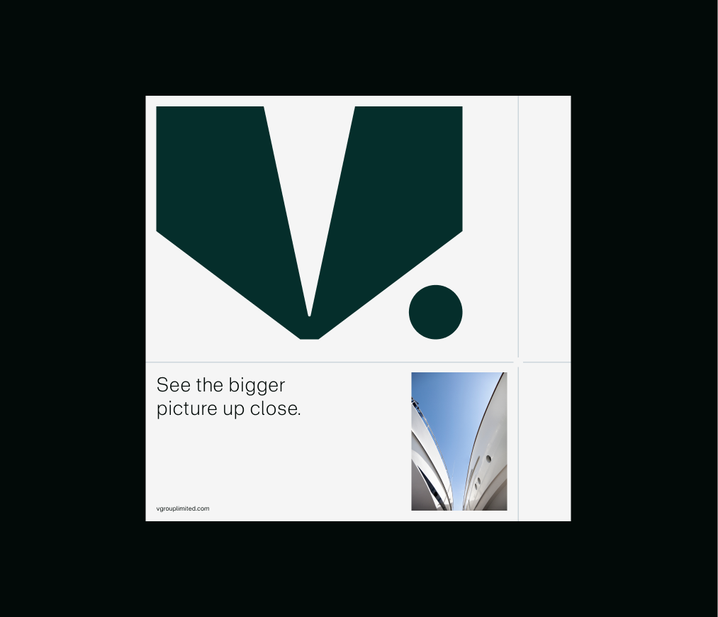
To ensure consistency across all applications, our logo should either be placed in the top left corner as a hero intro, or in the bottom right, as a sign off. In specific instances where our logo stands alone, for example a film endframe, our logo can be used centrally. Our logo should only ever appear once.
Flexibility
Our logo is strong and confident, while also able to flex
to meet the needs of a range of applications.
It can be used smaller, in more subtle ways to allow our warmth and human qualities to shine, or we can scale it up
to use in a bold and assertive way that evokes the scale and physicality of the shipping industry. For more detail, please consult the Layout system section.
Small scale
We use our margin rules as a basis for small scale usage, for example social avatars or app icons.
In use
Things to avoid
Do not change the proportions of elements within the logo.
Do not rotate our logo.
Don’t use two colours within our logo.
Don’t add a drop shadow or other effects to our logo.
Do not skew or distort our core logo.
Do not crop the logo.
Do not use the logo as an outline.
Don’t use in any colourways that aren’t specified in the guidelines.
Partnerships
We use the same margin rules as our own logos for spacing of partnership logos, making sure the sizing of the partner logo is the same as the V. logo.
Sub-brands
We have individually crafted logos for the products and services that make up our sub-brands. These follow the same margin rules as our main logo.
In use
Endorsed brands
Products and services that are adjacenies to the core offering use a specific lockup to show their relationship to V. This follows the same margin rules as our core logo.
In use
Film
For our most expressive moments, our core logo can chart
a whole new dimension.
Our motion version shows our inspiration, the bow of a ship, and the transformative connection that V. brings between physical and digital worlds. We use this in contexts where richer, more dynamic and inspirational imagery is appropriate.